As a Product Designer I iterated on and tested landing pages with special sales offers.
.png)
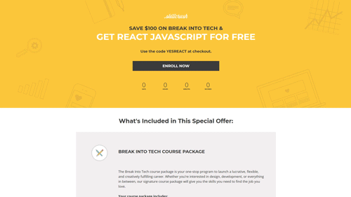
The purpose of these landing pages was to provide sales touch points through email campaigns with special offers. Since the layouts had no testing, I pushed to optimize them to better communicate our value proposition and convert more sales.
These landing pages act as mini sales pages with CTAs to check out.
We create the landing pages using a product called LeadPages. The product allows you to drag and drop layouts, as well as add custom code. A major challenge of reworking the proposition on this page is explaining the value of our largest product in addition to the special offer.
As a product designer I created the iterations, conducted user tests, heatmaps, and split testing. To meet our needs we use a fair bit of custom code in LeadPages which I was familiar with altering and editing. I also fixed bugs on the code level, and performed QA testing as a part of my process.
Our goal was to create an evergreen layout for these special offers. We wanted to have less assumptions about some of the decisions we had made-- like visual style, explanation of value, and call to action.
We tested it's visual design / look and feel. I started with some heatmaps, and split tests. This gave us a better sense of what was happening on the page and which elements affected the call to action at the bottom. We learned insights about using a more skill / class based layout vs a more people focused layout. We found there was no preference from a conversion perspective. This gave us the confidence to lean into the human element as its a better fit with our mission and branding.

We tested how the details of our courses we're laid out. We used user tests that involved comparing to get some feedback. We found that a more visually simplified product description, and highlighting the concerns around the call to action at the bottom making sense to participants.


We also experimented with motion. Removing straight lines from sections like in these two examples:


The biggest thing we learned was we could afford to be more bold in our visual design. It was also important to get that validation around the call to action at the bottom and feel that we were addressing user concerns.
One big challenge was that we didn't have the time to extensively test things. We had to create and ship one of these pages in a few days. So we over came this problem by using each new sales cycle to iterate over time. We we're also limited by the tools we had to use-- in this case we designers we're designing, developing, and deploying these pages using LeadPages.


